
By Sarah Prestbury – Senior Consultant
Throughout these blogs, you will learn how to leverage some of the built-in functionality of QuickSight to enhance your dashboards and make them interactive. In the first series, we will look at filters – a building block of any report. In the next series, we will explore parameters and actions. We use AWS QuickSight as one of the leading BI tools we partner with, due to the speed and affordability it allows in gaining insights into data.
To highlight these features, I have created a dashboard using the Cryptocurrency dataset from Snowflake Data Marketplace. In an upcoming blog post, we will look at the benefits of pairing Snowflake with QuickSight in more detail. It’ll show you how to go from data to dashboard in just a few clicks.
Filtering
What are filters?
Filtering is a common reporting requirement that grants users the ability to refine displayed data based on conditions. It is a key step in turning static business reporting into interactive dashboards driven by users’ own analytical needs and curiosities. There are three types of filters within QuickSight – text, numeric, and date.
There are three layers in QuickSight – the dataset layer, where you import your data; the analysis layer, where you develop your visuals; and the dashboard layer, the final front-end view of the analysis.
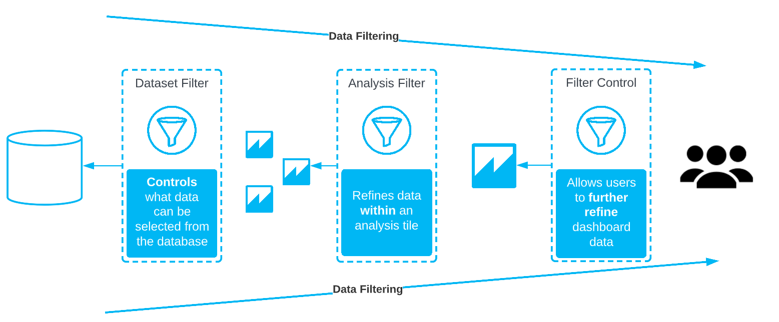
Filters can apply to both the dataset layer and the analysis layer. If you apply a filter at the dataset layer – it will limit the data a user can see across all analyses and dashboards using that dataset. If you create a filter at the analysis layer – it will only be visible in that analysis and will only apply to the selected visuals within.
In the analysis layer, filters are hidden from the front-end user or made visible by way of a filter control so that they can be interacted with. You may want to apply a fixed filter to a visual or set of visuals that the user cannot see or edit. Or you may want to add a filter that users can interact with to slice and dice the data – such as the ability to change the date range in a dashboard or select a specific region or category.
In this blog series, we use Cryptocurrency data to explore some of the common filtering requirements we use for reporting here at synvert TCM (formerly Crimson Macaw).
Creating a text list filter
I have a small number of digital coins in the cryptocurrency Stellar Lumens. I want to create a dashboard that tracks the performance of Lumens over time, so I can understand if my investment is doing well. The dataset I am using stores information across a broad number of different cryptocurrencies which can get a bit noisy. To solve this, I need to apply a filter to the type of cryptocurrency displayed. However, as I still want to be able to compare Steller Lumens to other currencies in further analyses, I will create a filter in the analysis layer rather than on the dataset itself. To easily create a new filter in the analysis I just need to:
- Open the analysis and select a visual to I apply the filter to
- Navigate to the ‘Filter’ tab on the left-hand menu and click ‘add filter’
- Choose the field to filter by – I chose Cryptocurrency Name
- By default, the filter selection is set to show all so I need to untick this and select Stellar Lumens
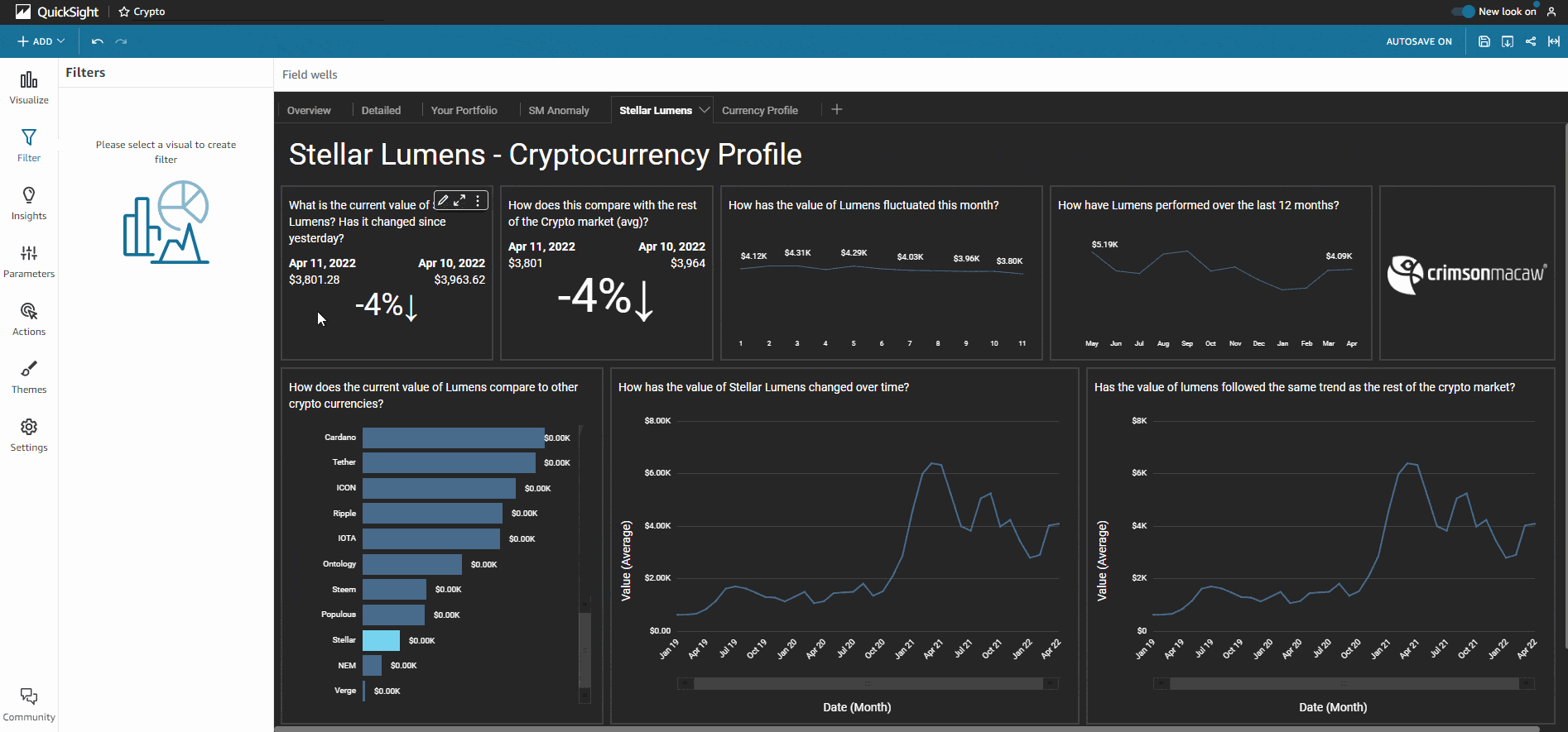
My visual is now filtered
By default, a filter applies only to the item that was selected when the filter was created. I want this filter to apply some of my visuals, but not those which show the comparison of Lumens to other currencies. Within the edit filter pane, I can select to apply my filter to ‘Some visuals’ and select only the visual titles relevant.
I also have the option to apply the filter to all the visuals in the dataset and all applicable visuals. Selecting all applicable visuals enable filtering across different datasets used in the same analysis where columns within each dataset have matching names.
There are other ways of filtering data in addition to a filter list, for example, I could use the top and bottom filter type to quickly display the top five cryptocurrencies with the highest value or create a custom filter condition to only show values that meet that condition.
Using filter controls
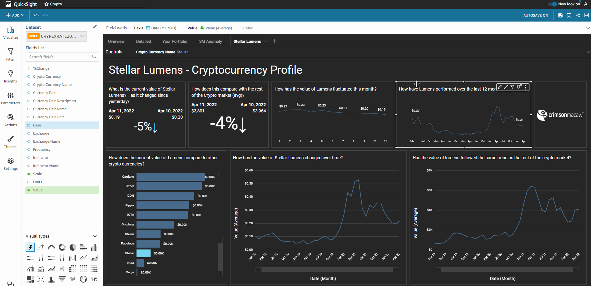
At this point, the filter is hidden from users. However, I want to be able to share my work with my colleagues, who have invested in other cryptocurrencies and will want to filter the visuals to show the information relevant to them. To do this, I need to create a filter control:
- Navigate to the filter pane within the analysis
- Next to the filter name, click on the ellipses
- Select ‘add to sheet’ from the dropdown menu
- The filter will now show as its own element on the analysis sheet
- Use the pencil icon on the top of the filter element to edit how the users view and interact with the filter – e.g., changing the filter name displayed, displaying the filter options as a list, enabling the option of multi-select. I have chosen the drop-down style option to avoid the dashboard becoming overly cluttered with long lists of currency names.
Utilising relative date filters
Cryptocurrency is a fast-changing environment, so I want to view my dashboard with the latest data. I need to be able to see the value of my Lumens today, but I also want to keep an eye on the overall trend over time. I can do this by using a relative date filter set to different periods of time for each visual. For example, the visual highlighted is set to show the last 12 months of data, relative to today’s date. Using a relative date filter is an effective way to automate your reports to always show the latest information.
To add a relative date filter to an analysis:
- Click the add filter button in the edit filter pane
- Choose the date field for your data
- Within the edit filter setting, change the filter type to ‘relative dates’
- Select the period and range required. We have selected to show the last 12 months
- If you would like to apply this filter to other visuals in the same sheet, use the applied to drop down at the top and select the other visuals
- Once you are done click apply
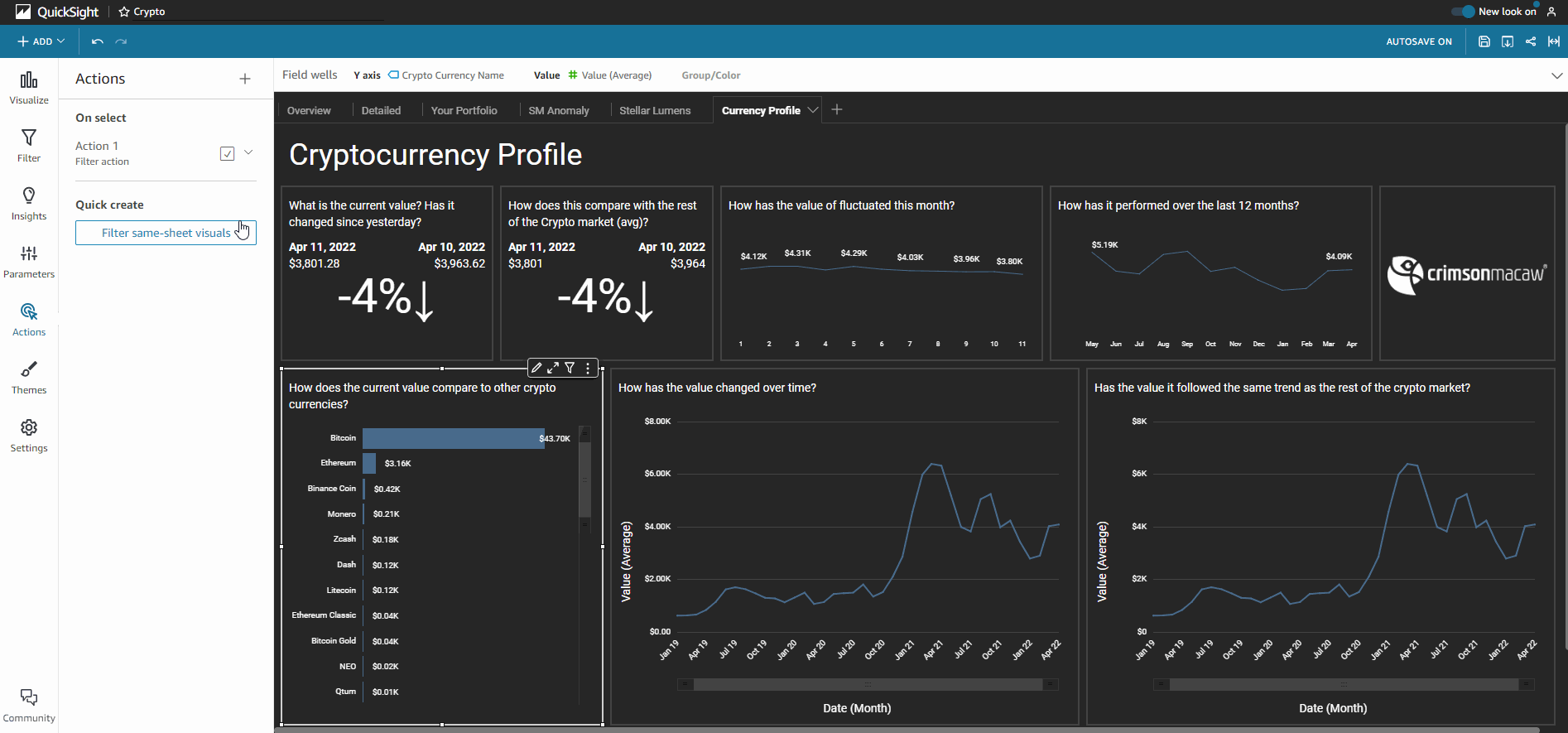
Cross Filtering
One of the fastest ways to create a fun and interactive dashboard is to enable the cross-filtering of visuals. Cross-filtering allows users to filter the entire dashboard when selecting data points within visuals. To enable cross-filtering on your QuickSight dashboard, head to the Actions pane in the left-hand menu or analysis. Select ‘Quick create: Filter same-sheet visuals’ and you are done!
Tip: This action works best with visualisation types such as bar charts, geographical maps, and tree maps that provide users with categories or groupings to select from.
Filtering across data sets
One of the cool features QuickSight has launched in the past 18 months is the ability to filter across different datasets on the same dashboard. This means you can incorporate different data sets in your reporting but have a single control for filters. It helps keep the user experience clean and simple. The best thing about this feature is that QuickSight auto-maps fields across your data sets by their name and type. it also applies that mapping to work with those common fields, meaning you don’t have to do any leg work yourself in setting this up. However, remember to ensure you have consistent naming conventions across the datasets.
One of the most common use cases for this at synvert TCM is filtering by reporting date across data sets. Allowing you to have top-level business reporting of key metrics from different areas of a business, on one page, with a single date filter control that updates across all visuals.
Order of evaluation
When using filters with calculated fields, one thing to keep in mind is QuickSight’s order of evaluation. This refers to the order of the steps that QuickSight takes to convert your data from the original source to the displayed data. This depends on both the type of filter and the calculation performed.
- Applying filters to the data before any aggregate functions that you specify
- If you create multiple filters, all top-level filters apply together using AND
- If you group filters by adding them inside a top-level filter, the filters in the group apply using OR
For more information on Order of Evaluation click here.
Summary
In this series, we have learnt what filters are, how they can be used in QuickSight, and how to create filters for a handful of use cases. In upcoming posts, we will explore using Quicksight parameters and actions, so make sure to keep an eye out for those. If you want to know more about QuickSight, you can contact us here.